 RIANNE LINKS
Creating a scalable and easy to use navigation system across all Achmea’s pension websites and portals
The existing navigation no longer supported the growing needs of users and the organization. I redesigned the navigation to create a clearer, more consistent experience and a flexible structure that can grow across websites, portals and devices.
 Situation
An outdated navigation structure
The main navigation for Achmea’s websites and pension portals no longer met the needs of users and internal teams. It also wasn’t optimized for mobile, creating the need for a more flexible and future-proof navigation system.
Problem
Usability issues hindered users
The existing navigation created several usability issues. Users could not always see where they were, submenu behavior was unclear and inconsistent, and the navigation had limited room to grow. The mobile experience introduced additional usability issues.
Solution
A new experience based on research with users
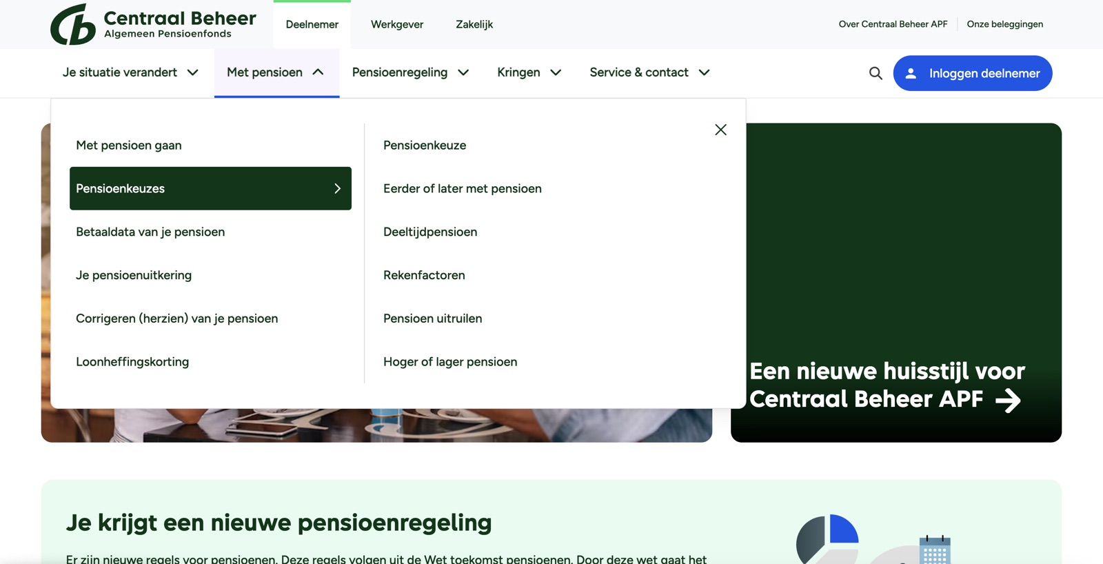
I redesigned the navigation based on UX research and established interaction patterns. I introduced click-based submenus, clearer active states, an optional third navigation level, and a dedicated mobile experience. This created a more consistent and accessible navigation structure across websites and portals.
Try out the navigation on these websites:
www.shellpensioen.nl |
www.centraalbeheerapf.nl
Result
A better experience for users and internal teams
The redesign created a scalable navigation system for both websites and portals. It provides more room for future menu items and greater flexibility in structuring content, while establishing a consistent foundation for desktop and mobile navigation.