 RIANNE LINKS
Bridging design and development with a shared design token system
With multiple pension funds and visual identities, maintaining consistency across design and development was becoming increasingly complex. I set up a scalable design token system that connects Figma and development and creates a shared foundation for both teams.
 Situation
Complex styling for each pension fund
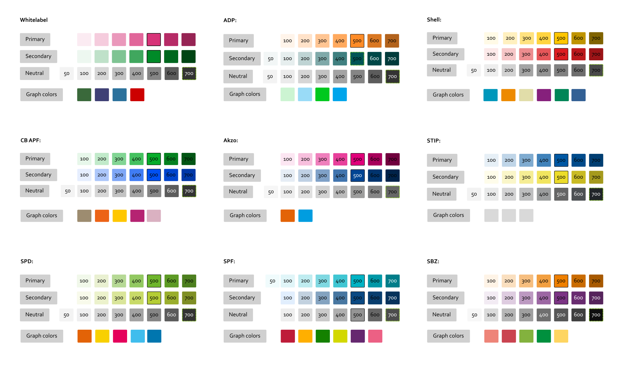
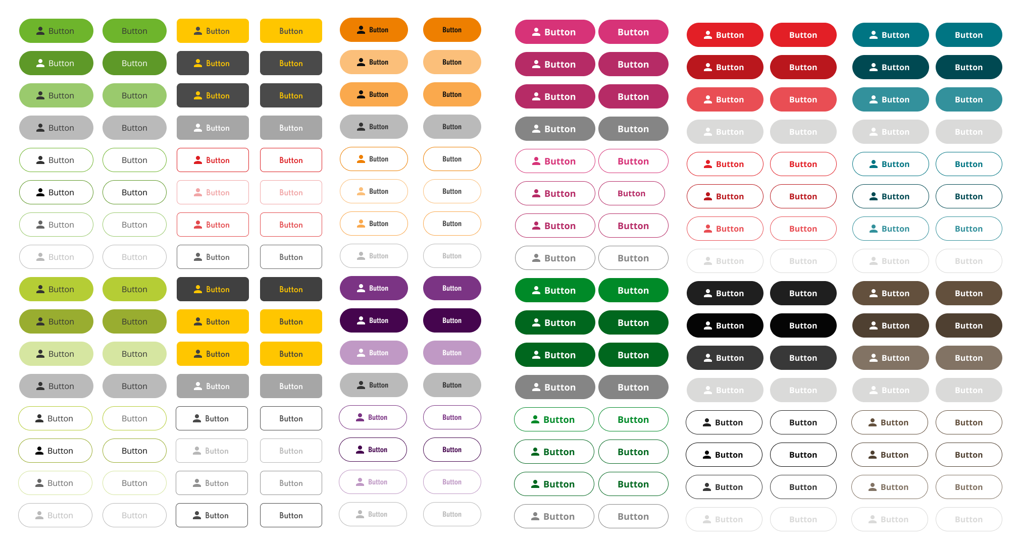
Our design system supports multiple pension funds, each with its own visual identity. Colors, typography, spacing and sizing therefore need to work across different fund-specific styles.
Problem
Difficult to stay up to date in design and development
When a pension fund changes a color in their style guide, we had to update everything manually. We needed a scalable way to keep design and front-end styling consistent across all pension funds.
Solution
Scalable and easy to use
With the help of AI, I analysed the current styles of all pension funds to establish where they are different from each other and which tokens varied per pension fund.
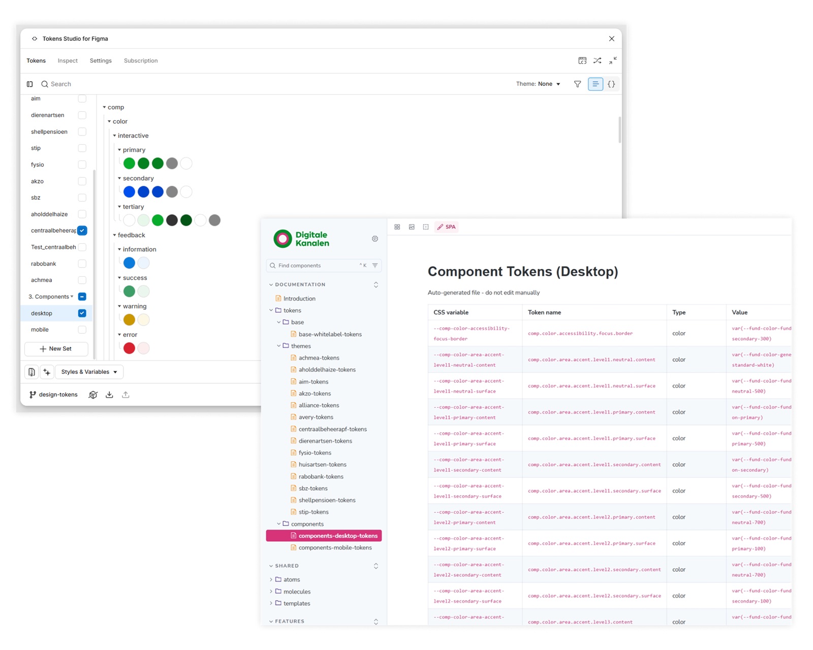
I build a three-level token architecture, which is easily scalable and makes updates easy to implement. I collaborated with the lead front-end developer to create a setup that works in development as well. This made rolling out easy and made the dev team enthusiastic to start using the tokens.
Result
A single source of truth
Within a couple of months, the tokens were implemented in both Figma and development, documented in Storybook, and adopted by the development team. By involving UX designers and front-end developers early in the process, I helped shape a system that works for everyone and is easy to use.